2022 · UX Designer @ JoinRider
Share adventures
JoinRider helps digital nomads and travelers share experiences with people around them. Allowing them to split trip costs, reduce their carbon footprint and increase their chances of having remarkable adventures.
However, users struggled to set up events within the app for the activities they wanted to share. I was hired as a freelancer to help improve the app's usability and increase users' trust in the platform.

BEFORE
AFTER
Getting to know the travelers
I started by talking to users and running usability tests of the current solution. This exploration led us to two distinct kinds of people who want to create events: the host and the explorer.
The first one wants to run events almost as a job. They've been in the location for a while and know their way around it, so they leverage their knowledge to run events that help newcomers discover the area, make connections and settle down.
The explorer is interested in finding people to have adventures together. They want to go places, be active, explore their surroundings, and make friends on the journey.
Findings
People mainly use groups in messaging apps to invite others for an activity. But large message groups are messy. Making it difficult for organizers to control who wants to go, charge to cover the activity costs, and keep in contact with participants.
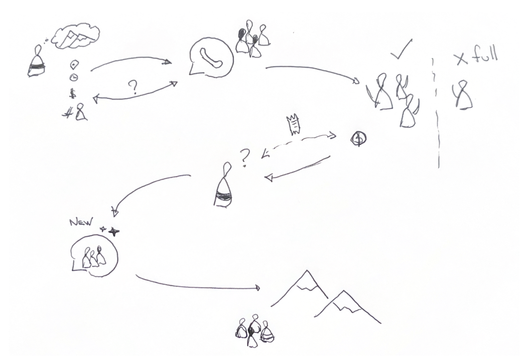
Experience map - How people were handling events without JoinRider
Users liked that with JoinRider, the payments, seat availability, and cancelations were all automatically handled. But during the tests, they showed some confusion while creating events. People struggled to fill out the number of participants, add costs, and select the appropriate parameters for the event. For them, the setup form felt tedious and unpolished.
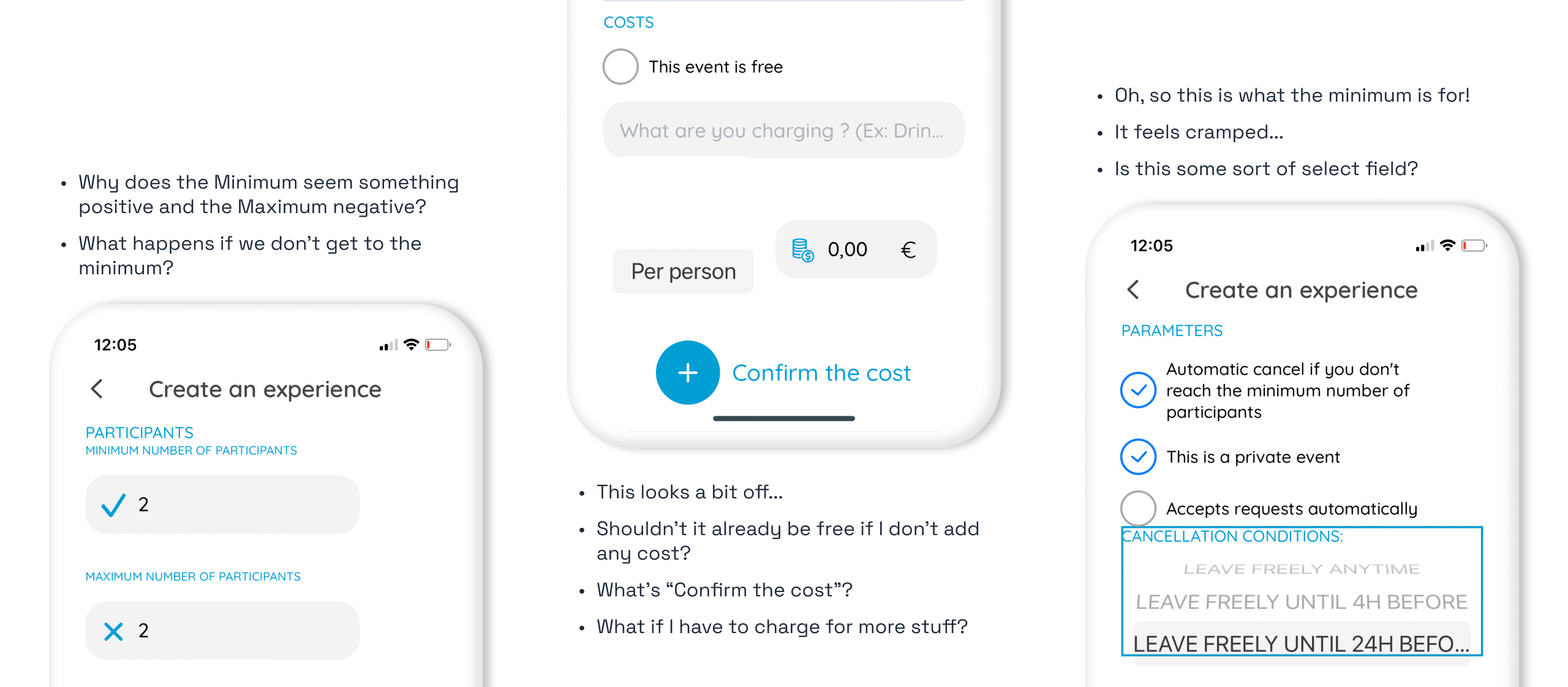
What users were saying
Defining the challenge
Armed with our understanding of users, I gathered the JoinRider team to define the new solution's boundaries. We started by aligning on the user's goal and needs:
User's goal
When digital nomads/travelers find an activity they need/want more people to do, they want to invite people along to find companions.
Needs
- Share new activities easily - avoid friction on inviting people
- Have
precise control of costs to show participants they are being fair. For the JoinRider team, this translates in:
- Fixed costs - a fixed amount per person
- Split costs - an amount divided among participants
- The ability to make some costs optional (e.g., alcoholic drinks at a party event)
-
Effortlessly accept payments and manage people joining an activity
- People we interviewed mainly use Paypal to pay for the events but would also like to use credit cards.
- Set up a clear cancelation policy to avoid any possible friction.
Exploring solutions
Given the user's goal and needs, I began defining all the essential inputs to create a new event and sketched flows and possible ways to fulfill them.
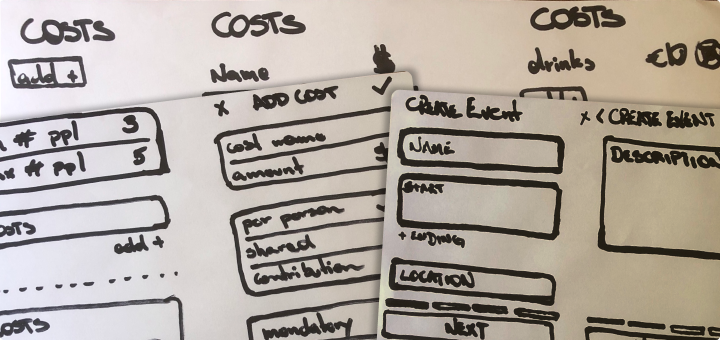
Iterating on feedback from the team, I understood the need to handle some edge cases. For example, when offering to share a ride, users may already have a guest coming along; or a host might only be able to make the event happen if there is a minimum number of participants. How can we account for those required edge cases when creating an event, and how do we make it straightforward for people to understand?
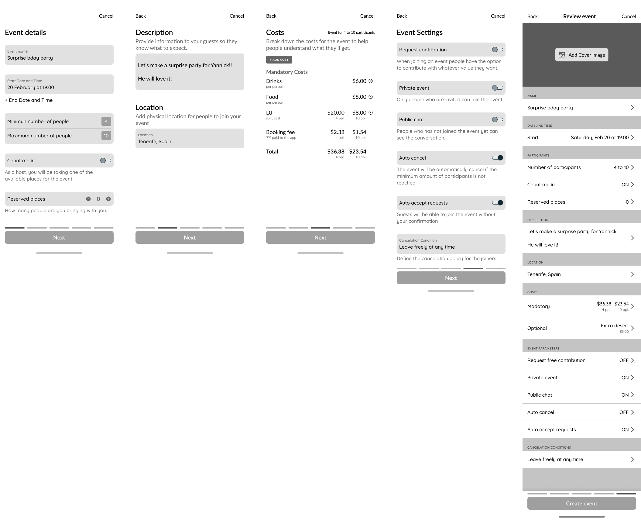
After many discussions, we narrowed it down to two main proposals: a one-page form - to make it straightforward and efficient; and a multi-page structure - to give it a cadence and provide deeper explanations.
One-pager

Multi-page
Results and final designs
Usability tests showed that users felt more confident by following the multi-page structure; it gave them time and space to think about each input field, reducing the number of mistakes and unfulfilled inputs.
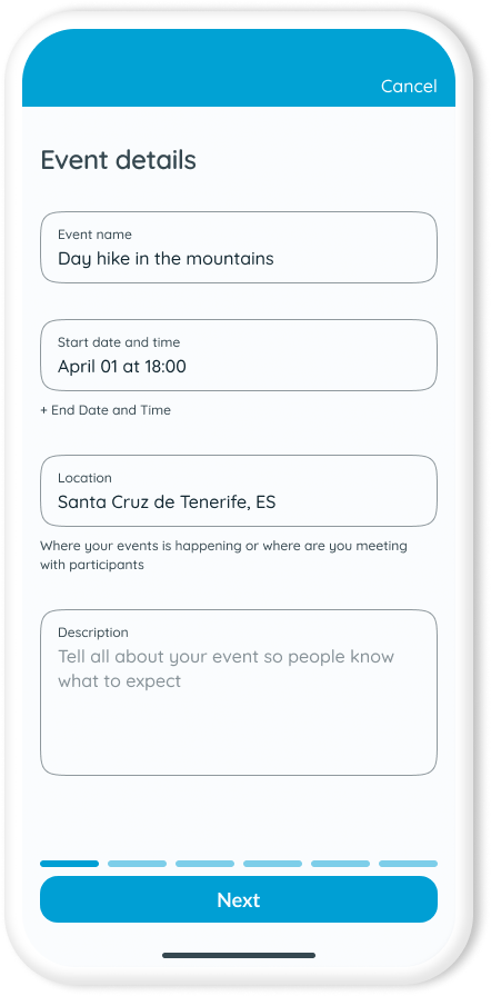
The process's first step is all about what, where, and when, the basics that users already expect. Compared to the previous version, a slight improvement we made here is having the "End date and time" as an optional field - only some events need an end time.
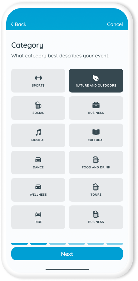
In the following step, users must choose a Category that best describes their event. At the time JoinRider didn't have a search engine, but we wanted to future-proof the feature by preparing the events to be filtered.
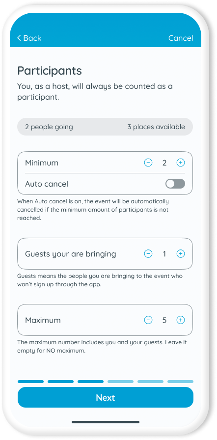
The third step is where users set up participants. Our end goal is to have the available places for an event. We could directly ask users for the number of seats offered, which would work well for people who only want to act as event organizers. But JoinRider intends to go further and help users share experiences. To do that, we need to split costs explicitly and fairly, making it essential to account for everyone who would attend an event.
The best solution we arrived at was breaking participants into three inputs: Minimum defines the minimum amount of people required to make the event possible; Guests are people that should be counted in the cost split but are not joining through the app; and Maximum, is the maximum amount of participants including the host and their guests. To help users understand what's happening, we dynamically display the number of participants going and the available places according to the inputs.
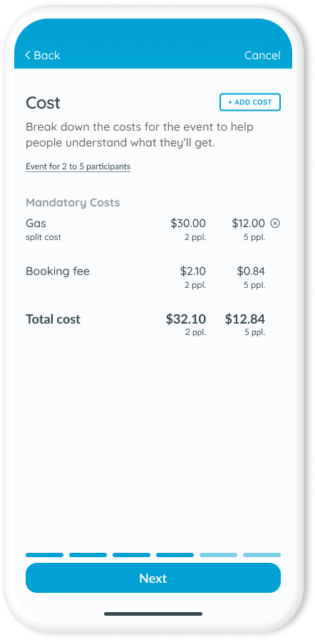
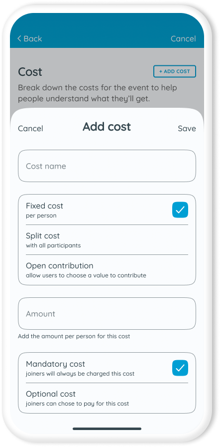
Then comes the costs. Costs for JoinRider can have three types: Fixed per person, Split among participants, and Open contribution, allowing users to contribute with whatever value they please. Besides that, each cost can also be mandatory or optional - handy when you want to let people choose to pay or not for alcoholic drinks for a party.
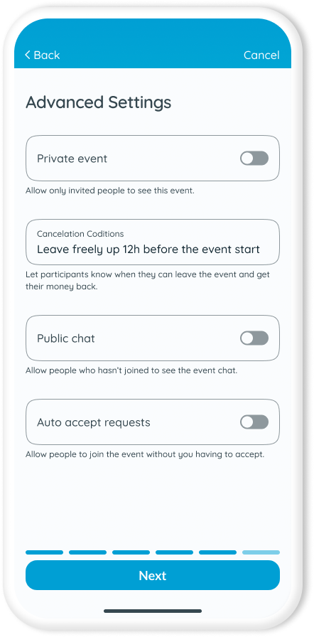
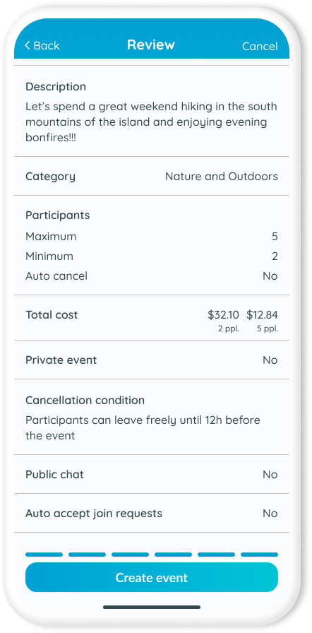
The fifth step provides users with advanced parameters to control the event privacy, cancellation conditions, chat publicity, and joining requests, lighting the burden of managing the event for the organizers.
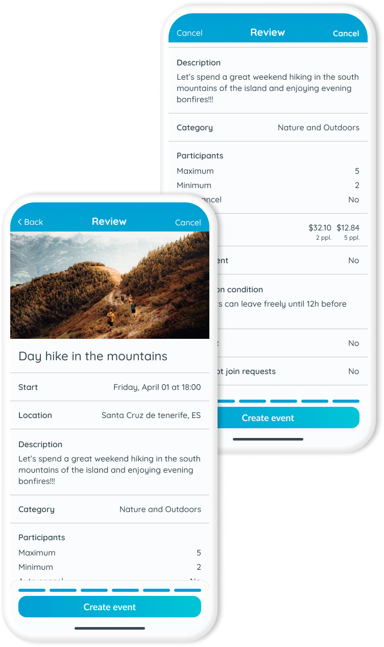
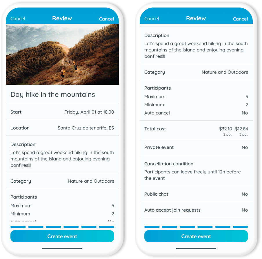
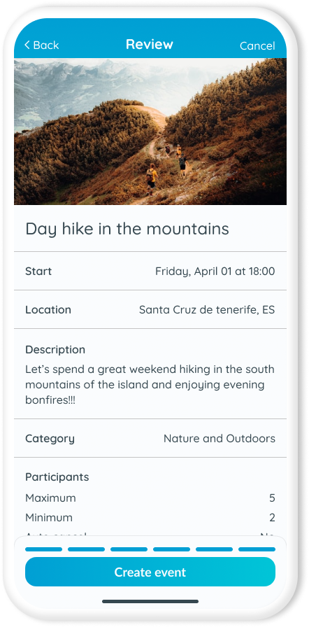
Finally, in the last step, users can add a cover image and review the event setup. If they need to edit any of the fields, users can directly click on it, and they will go back to edit the input.
Final thoughts
The new design improved the app's overall user experience, making it more trustworthy and enjoyable for digital nomads and travelers to share their adventures. But I believe it's good to keep in mind that even though the multi-page structure made it easier for everyone to create events, the one-pager may be an option once the app gains traction to help advanced users become more efficient, create more events and share with more people wanting to join new adventures.